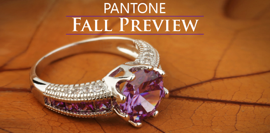
As fashion trends shift each season, we see a new mix of colors taking center stage. And each season, Pantone, the world’s leading expert on color, releases their color trend report. For Fall 2018, Pantone has curated a collection of hues that represent all the colors of the rainbow. Some are autumn and winter staples, such as red, but some are new on the season, like a lemony yellow. A lemony yellow might seem strange for the fall, but when paired with the right partner, it can be cooler weather perfection. There are 10 colors in Pantone’s Fall 2018 report, which you can view here. But for the lowdown on these colors and which stones you can use to achieve a trendy fall look, just keep reading below.
| Let’s start with a couple of autumn standbys. Red is standard for fall and winter. But Pantone has previewed two different shades of everyone’s favorite fiery hue. Red Pear and Valiant Poppy are two very distinctive colors. Red Pear is a darker, browner red. It’s not quite as brown as a brick red. If you frequent the produce section of your local grocery store, the color really truly is the color you see on the skin of red pears. This shade of red is a no-brainer for fall colors. Replicating this color in jewelry is pretty simple. Garnet would be a good choice for those who want to sport Red Pear in their jewelry. In my opinion, garnet’s warm undertones are best enhanced by yellow gold or rose gold. | 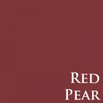 |

|
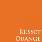
If you prefer something a little brighter, you can go with the Valiant Poppy, which is closer to the standard red we think of when we think of autumn red. If you prefer the slightly more orange Valiant Poppy, you can select specific rubies or garnets. Although garnets are usually on the browner end of the red spectrum, there are some varieties that are orange. Spessartite garnet, for example, is noticeably reddish orange. In fact, it’s more orange than red. But that spessartite garnet color could actually work if you want to achieve a look using the Russet Orange color suggested in Pantone’s fall preview. However, a pyrope garnet is still a darker red (like standard garnet), but it has brighter and warmer undertones, rather than brown. Like the browner garnets, spessartite and pyrope garnets will look best featured in yellow gold. In fact, I would even suggest using 18k gold for spessartite and pyrope garnets. Eighteen karat yellow gold is a richer, more orange hue of gold. It would set off the garnets beautifully.
|
| Pantone also included Ultra Violet in the fall rainbow roundup. If that name sounds familiar, it’s because Pantone named Ultra Violet the 2018 Color of the Year. Ultra Violet can be worn in jewelry by utilizing amethyst stones. Amethyst is a vibrant and rich purple color. The complexity of such an intriguing purple is best foiled by the streamlined cool of white gold. Amethyst is a great gem too because it really can be worn year-round. It moves seamlessly from fall to winter. Then, as the flowers bloom in the spring, amethyst blends right in with spring’s colorful and light palette (especially if you choose a lighter amethyst color). The flowery hue continues right on into summer, which then brings us back to fall. |  |
 |
Now, my personal favorite in Pantone’s fall lineup is Quetzal Green. This luscious dark green-blue looks like spending a quiet and drizzly afternoon snuggling in a warm fluffy blanket. I may think that because I have a throw blanket in that exact color, but the fact remains that it is a departure from the run-of-the-mill warm tones of fall palettes. Finding this color in the gem world is definitely possible, but it will take a little looking and working with a jeweler to locate the right shade. My suggestion would be to look at aquamarine and blue topaz. Although both of these gemstones generally occur in lighter and truer blue shades, you can find dark greenish blue aquamarines. They are very close to the color of Quetzal Green, if just a little more blue. Topaz comes in a lot of colors, including several varieties of blue. The closest to Quetzal Green is London blue topaz. London blue topaz is a darker shade of blue that borders on a grayish or greenish tint. It’s a popular choice for use in colored gemstone jewelry. |
There are more colors in Pantone’s Fall Color Preview and there are more gemstone choices. To make the most of your jewelry box and the color trends, come in to our downtown Brighton showroom. You’ll be able to peruse our collection of colored gemstone jewelry. And if you don’t find the right gem or the right piece, don’t worry; we can sit down with you and start designing a custom piece.
Until next time,
Rebecca